Picker
This widget allows you to pick elements from arbitrary data containers. The selected element will then be rendered in its back end view.
This is used to pick a record for the “Content element” content element for example:
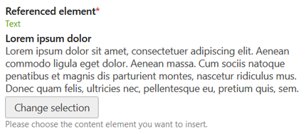
When picking the element, a back end view will be rendered in the popup which allows you to switch between page articles, news articles,
calendars etc. where you will be able to go into one of the parents to select a content element from there. The preview is then rendered via
the child_record_callback of tl_content in this case.
You could also select news articles for example:
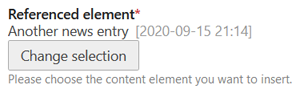
The picker popup will show you the regular back end view of the news archives in this case which allows you to then select a news article from any of these archives.
Options
This table only shows the options relevant to the core functionality of this widget. See the DCA reference for a full field reference.
| Key | Value | Description |
|---|---|---|
inputType |
picker |
|
foreignKey |
string |
Reference another table to pick from (can also be done via relation) |
relation |
array |
Reference another table to pick from via 'table' => 'tl_foobar' |
eval.multiple |
true/false (default) bool |
Set this to true if you want to be able to select multiple values. |
eval.isSortable |
true/false (default) bool |
When used with 'multiple' => true, allows for manual reordering using drag-n-drop. |
Column Definition
Depending on the widget configuration, the widget persists different values to the database. You have to take care of the correct SQL column definition yourself. A single record will be saved as an integer, the primary key reference. Multiple selected values are stored as a serialized array. Since you do not know the length in advance, a blob column is preferred.
Examples
// ...
'myNewsReference' => [
    'label' => ['Referenced news', 'Help text'],
    'inputType' => 'picker',
    'sql' => [
        'type' => 'integer',
        'unsigned' => true,
        'default' => 0,
    ],
    'relation' => [
        'type' => 'hasOne',
        'load' => 'lazy',
        'table' => 'tl_news',
    ],
],
// ...
// ...
'myContentElements' => [
    'label' => ['Referenced elements', 'Help text'],
    'inputType' => 'picker',
    'eval' => [
        'multiple' => true,
    ],
    'sql' => [
        'type' => 'blob',
        'notnull' => false,
    ],
    'relation' => [
        'type' => 'hasMany',
        'load' => 'lazy',
        'table' => 'tl_content',
    ],
],
// ...
If you use your own data container table with a custom driver, you will need to implement a basic picker provider
(otherwise the field will not be editable). A picker provider is a class which implements
Contao\CoreBundle\Picker\PickerProviderInterface, or a service tagged as contao.picker_provider. However, in most
cases it’s enough to simply extend a Contao\CoreBundle\Picker\AbstractTablePickerProvider class:
// ...
'myProducts' => [
    'label' => ['Referenced products', 'Help text'],
    'inputType' => 'picker',
    'eval' => [
        'multiple' => true,
    ],
    'sql' => [
        'type' => 'blob',
        'notnull' => false,
    ],
    'relation' => [
        'type' => 'hasMany',
        'load' => 'lazy',
        'table' => 'tl_product',
    ],
],
// ...
// src/Picker/ProductsPickerProvider.php
namespace App\Picker;

use App\Driver\DC_Product;
use Contao\CoreBundle\Picker\AbstractTablePickerProvider;

class ProductsPickerProvider extends AbstractTablePickerProvider
{
    public function getName(): string
    {
        return 'productsPicker';
    }

    protected function getDataContainer(): string
    {
        return DC_Product::class;
    }
}
Usage in Contao
This picker is used for content element and article include content element as well as the article teaser content element in order to pick and preview the referenced element or article.