Checkbox
This widget renders one or multiple checkboxes. Choose this if you want the editor to toggle a single property or select from a fixed set of options.
A simple binary checkbox that allows the editor to toggle a boolean state:

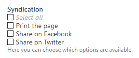
Multiple checkboxes to give the editor a defined set of options to select one or many options from:
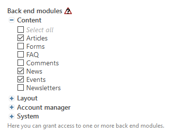
Multiple checkboxes to choose from as before, but grouped into categories:
Options
This table only shows the options relevant to the core functionality of this widget. See the DCA reference for a full field reference.
| Key | Value | Description |
|---|---|---|
inputType |
checkbox |
|
options |
array |
An options array (use in combination with eval.multiple) |
options_callback |
function|callable |
A callback function that returns the options callback or an array (use in combination with eval.multiple). You may define an anonymous function, but you should consider registering them via annotations. |
reference |
array |
Reference an array that will be used to translate the options. Contao will automatically match the options and reference array by key. |
foreignKey |
string |
Reference another table to generate options from. |
eval.multiple |
true/false (default) bool |
Set this to true if you want to provide multiple options via options or options_callback |
eval.includeBlankOption |
true/false (default) bool |
Includes a blank option (useful in conjunction with mandatory fields) |
eval.blankOptionLabel |
string (default -) |
The label of the blank option |
The options array – either set directly or returned by an options callback – can have different structures depending on what you are going for:
[ 'label1' , 'label2' ]where the values of the checkbox input will be the regular array index.[ 'value' => 'label' ]wherevaluewill be the value of the checkbox input, andlabelthe label.[ 'foo' => ['a', 'b'], 'bar' => ['c', 'd'] ]which will render two checkbox groupsfooandbar.
Column Definition
Depending on the widget configuration, the widget persists different values to the database. You have to take care of the correct SQL column definition yourself. A single checkbox (toggle) will be saved as '1'/'0' (text column) or true/false (bool column). Multiple selected values are stored as serialized array. Since you do not know the length in advance, a blob column is prefered.
Examples
If you simply want to toggle a property:
// ...
'myCheckbox' => [
    'label' => ['Checkbox', 'Help text'],
    'inputType' => 'checkbox',
    'sql' => [
        'type' => 'boolean',
        'default' => false,
    ],
],
// ...
If you want the editor to select from a fixed set of properties, you may define them via the options field. The selected options will be stored as a serialized array, so make sure your database field can store enough data.
// ...
'myCheckbox' => [
    'label' => ['Checkbox', 'Help text'], // Or a reference to the global language array
    'inputType' => 'checkbox',
    'options' => [
        'foo', 'bar', 'baz',
    ],
    'eval' => [
        'multiple' => true,
    ],
    'sql' => [
        'type' => 'blob',
    ],
],
// ...
You can also dynamically generate the options array to filter them as you wish. See the options callback for further examples.
// ...
'myCheckbox' => [
    'label' => ['Checkbox', 'Help text'], // Or a reference to the global language array
    'inputType' => 'checkbox',
    'options_callback' => [
        'Vendor\Class', 'getMyCheckboxOptions' // Defines a method that returns the options array. Class can be a service.
    ],
    'eval' => [
        'multiple' => true,
    ],
    'sql' => [
        'type' => 'blob',
    ],
],
// ...
You can generate an options array from another table with the foreignKey property.
// ...
'myUsers' => [
    'label' => ['My Users', 'Help text'], // Or a reference to the global language array
    'inputType' => 'checkbox',
    'foreignKey' => 'tl_user.name', // Will use `name` as label, and the user `id` as value
    'sql' => [
        'type' => 'string',
        'notnull' => false,
        'default' => '',
    ],
],
// ...
Usage in Contao
Basically everywhere :-) The checkbox widget in its simplest configuration is often used to toggle subpalettes.