Grid System Introduction
A popular stylistic device is the division of content into columns. Here the use of “grid systems” has become established. The available area is divided into a fixed number of columns. A fixed outer distance is defined once for the total width and then between the individual columns of the grid itself.
For example, if you want to display two columns in a “12-column system”, you must assign six grids to each of your two areas. This assignment is done via CSS classes.
Among others, there are “12-column” or “16-column” implementations. Some are “pixel-based”, others “percentage-based”, and the spacing width can also vary with different systems. Ultimately, it is CSS information in order to display a defined HTML structure accordingly.
The first solutions were implemented via CSS-float. The advantage is the support of older browser versions. Realizations via CSS-flexbox followed and meanwhile the CSS-grid property itself exists. This is supported in current browser versions.
Often you will find the term “responsive” grid. This is not only the variable width adjustment of the individual columns depending on the total width, but you can control the number of columns per device or rather viewport width yourself. For example, the content can be displayed as “4-columns” on a desktop, “2-columns” on a tablet and just “1-column” on a smartphone.
The Contao grid
The Contao grid was already introduced with Contao version 3.0 and is based on the 960.gs. The implementation (via CSS-float) is “pixel-based” with 12 columns and 10 pixels CSS margin.
The total width of 960 pixels with two “breakpoints” at < 980 Pixel and < 768 Pixel is fixed.
The CSS classes available are grid1 to grid12 and offset1 to offset12.
The CSS file can be found in the directory assets/contao/css/grid.min.css or grid.css.
There you can also see under which conditions the spacing is set:
- Float and margin for all elements whose class contains the name
grid - Margin for all elements within
mod_articleif they contain a class starting withce_ormod_. - No margin for
mod_articlewith additionalgriddesignation.
The Contao grid can be integrated via your page layout in the section CSS framework > 12-column grid.
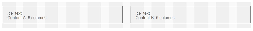
For “2-column” display of two content elements of type “text” you can enter the CSS class grid6 in the
area Expert Settings > CSS ID/Class. Above 768 pixels the content elements are always displayed in “2 columns”
and below 768 pixels in “1 column”.
The old Contao grid works with the above restrictions. However, it is recommended to use a current grid solution. Alternatively, there are numerous extensions available for simple installation.
CSS Grid Layout without extension
You are not restricted to the use of the »Contao-Grid«. With the »CSS Grid Layout« you can implement appropriate representations at any time using your own CSS specifications. Let’s assume you need two or more content elements of the type »Text« in an »article« and you want to split them into two columns.
For the grid definition you always need an enclosing HTML container. This is already available in the form of the article. The content elements are listed below each other in the article, in the respective order. First you set the CSS class »mygrid« in the »Expert settings« section of the article settings. Then create two or more content elements of type »Text«. With the following specifications you can realize a simple grid representation:
<div class="mod_article mygrid block" id="article-1">
    <div class="ce_text block">
      ...
    </div>
    <div class="ce_text block">
      ...
    </div>
</div>
.mygrid {
    display: grid;
    grid-template-columns: 1fr 1fr;
    grid-gap: 20px 20px;
}
If you want to set a grid only specifically within individual areas of an article, you can realize the enclosing HTML containers with the content element of the type »HTML«. Create two content elements with the specifications »<div class=“mygrid”>« and »</div>«. Your text elements must then be located within these two content elements of type »HTML«.
<div class="mod_article block" id="article-1">
    <div class="mygrid">
        <div class="ce_text block">
          ...
        </div>
        <div class="ce_text block">
          ...
        </div>
    </div>
</div>
.mygrid {
    display: grid;
    grid-template-columns: 1fr 1fr;
    grid-gap: 20px 20px;
}
The examples are deliberately kept simple. If you need a grid layout only occasionally, you can do this without any extension. Of course the »CSS Grid Layout« offers further possibilities and is well documented.
With an extension
For a comfortable implementation in the backend there are extensions, among others the »contao-grid-bundle«. The extension supports a »12 column grid« by default, based on the »CSS Grid Layout«, but can be customized as you like.
For the enclosing HTML containers, separate content elements are provided in the backend and in the content elements themselves, you can easily select the required columns for different viewports. Detailed information and documentation about the extension can be found on the project website.