Form fields
Similar to articles and content elements, forms will contain a separate element for each form field, which is specifically configured to meet the requirements for that field. Each form field must have at least one field name and one field label.
Field name: The field name is used to reference the user input after the form has been submitted. If you store the form data in the database, there must be a field in the table with the same name.
Field label: The field label is displayed in the frontend before or above the form field and should be written in the correct language for your users.
Mandatory field: If you select this option, the field must be filled in order to submit the form. If it remains empty, an error message will appear.
Explanation
The Explanation form field adds formatted description text to the form. The text is entered using the Rich Text Editor.
Text/HTML
Text: Here you can enter the formatted text for the explanation.
Expert settings
CSS class: Here you can enter one or more classes.
Template settings
Form field template: Here you can overwrite the default template form_explanation with your owm.
HTML Output
The form field generates the following HTML code:
<div class="widget widget-explanation explanation">
    <p>…</p>
</div>
HTML
The HTML form field adds HTML code to the form. In the backend settings under “AllowedHTML tags”, you can define
which HTML tags can be used.
Text/HTML
HTML: Enter your HTML code here.
Template settings
Form field template: Here you can overwrite the default template form_html with your owm.
HTML fields have no enclosing HTML markup.
Fieldset Start and Fieldset End
The fieldset element is used to group several inputs and labels in a web form.
Expert settings
CSS class: Here you can enter one or more classes.
Template settings
Form field template: Here you can overwrite the default templates form_fieldsetStart and form_fieldsetStop with
your owm.
HTML Output
The form field generates the following HTML code:
<fieldset>
    <legend>…</legend>
    <div class="widget widget-text mandatory">
        …
    </div>
    <div class="widget widget-text mandatory">
        …
    </div>
</fieldset>
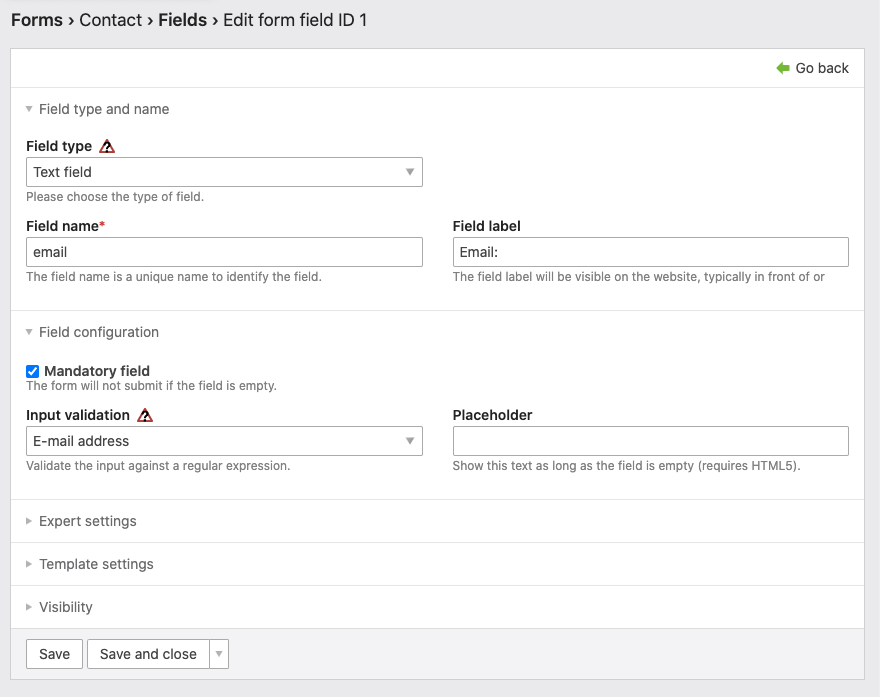
Text field
The Text Field form field adds a single-line input field to the form. You should always enable some form of input validation for each text field to prevent misuse of the form.
Field configuration
Input Validation: Here you can specify a search pattern that is used to check user input when the form is submitted.
| Search pattern | Declaration |
|---|---|
| Numeric characters | Allows numbers, minus (-), period (.) and spaces ( ). |
| Alphabetic characters | Allows letters, minus (-), period (.) and spaces ( ). |
| Alphanumeric characters | Allows numbers and letters, minus (-), period (.), underscore (_) and spaces ( ). |
| Extended alphanumeric characters | Allows all characters except those that are normally encoded for security reasons (#/()<=>). |
| Date | Allows entries according to the global date format. |
| Time of day | Allows entries according to the global time format. |
| Date and time | Allows input according to the global date and time format. |
| Phone number | Allows numbers, plus (+), minus (-), slash (/), round brackets (()) and spaces ( ). |
| E-mail address | Allows users to enter a valid email address. |
| URL format | Allows the entry of a valid URL. |
| Absolute URL | since 4.11 Allows users to enter absolute URLs (starting with http:// or https://). |
| Custom | since 4.11 Allows users to enter text according to the given custom regular expression. |
Placeholder: This text is displayed as long as the field has not been filled in.
Expert settings
CSS class: Here you can enter one or more CSS classes.
Default value: Here you can enter a default value. For accessible web pages, it is recommended to use the @ character for e-mail addresses.
Minimum input length: Here you can specify the minimum number of characters that can be entered in the text field.
Maximum input length: Here you can specify the maximum number of characters that can be entered in the text field.
Keyboard shortcut: A keyboard shortcut allows a visitor to jump directly to a certain input field by pressing the
[Alt] or [Strg] key in connection with the shortcut key, e.g. a number (see backend keyboard shortcuts).
Tab-Index: Here you can determine the position of the form field within the tab order.
Template settings
Form field template: Here you can overwrite the default template form_textfield with your owm.
HTML Output
The form field generates the following HTML code:
<div class="widget widget-text … mandatory">
    <label for="ctrl" class="… mandatory">
        <span class="invisible">Pflichtfeld </span>…<span class="mandatory">*</span>
    </label>
    <input type="text" name="…" id="ctrl" class="text … mandatory" value="" required placeholder="…" minlength="…" maxlength="…" accesskey="…" tabindex="…">
</div>
Password field
The form field Password adds two single-line input fields for the password and its confirmation to the form. In
principle, password fields work just like text fields, except that the input is hidden.
Template settings
Form field template: Here you can overwrite the default template form_password with your owm.
HTML Output
The form field generates the following HTML code:
<div class="widget widget-password mandatory">
    <label for="ctrl" class="mandatory">
        <span class="invisible">Mandatory field </span>Password<span class="mandatory">*</span>
    </label>
    <input type="password" name="…" id="ctrl" class="text password mandatory" value="" required>
</div>

<div class="widget widget-password confirm mandatory">
    <label for="ctrl_confirm" class="confirm mandatory">
        <span class="invisible">Mandatory field </span>Confirm<span class="mandatory">*</span>
    </label>
    <input type="password" name="…_confirm" id="ctrl_confirm" class="text password mandatory" value="" required>
</div>
Text area
The form field Text area adds a multiline input field to the form for longer text input. You should also activate the
input check here to prevent misuse of the form.
Field configuration
Input Validation: Here you can specify a search pattern that is used to check user input when the form is submitted.
| Search pattern | Declaration |
|---|---|
| Numeric characters | Allows numbers, minus (-), period (.) and spaces ( ). |
| Alphabetic characters | Allows letters, minus (-), period (.) and spaces ( ). |
| Alphanumeric characters | Allows numbers and letters, minus (-), period (.), underscore (_) and spaces ( ). |
| Extended alphanumeric characters | Allows all characters except those that are normally encoded for security reasons (#/()<=>). |
| Date | Allows entries according to the global date format. |
| Time of day | Allows entries according to the global time format. |
| Date and time | Allows input according to the global date and time format. |
| Phone number | Allows numbers, plus (+), minus (-), slash (/), round brackets (()) and spaces ( ). |
| E-mail address | Allows users to enter a valid email address. |
| URL format | Allows the entry of a valid URL. |
| Absolute URL | since 4.11 Allows users to enter absolute URLs (starting with http:// or https://). |
| Custom | since 4.11 Allows users to enter text according to the given custom regular expression. |
Placeholder: This text is displayed as long as the field has not been filled in.
Rows and columns
Rows and columns: Here you define how many rows and columns the text area should have. You can also define the dimensions of the field via CSS.
Expert settings
CSS class: Here you can enter one or more CSS classes.
Default value: Here you can enter a default value.
Minimum input length: Here you can specify the minimum number of characters that can be entered in the text field.
Maximum input length: Here you can specify the maximum number of characters that can be entered in the text field.
Keyboard shortcut: A keyboard shortcut allows a visitor to jump directly to a certain input field by pressing the
[Alt] or [Strg] key in connection with the shortcut key, e.g. a number (see backend keyboard shortcuts).
Tab Index: Here you can determine the position of the form field within the tab order.
Template settings
Form field template: Here you can overwrite the default template form_textarea with your owm.
HTML Output
The form field generates the following HTML code:
<div class="widget widget-textarea mandatory">
    <label for="ctrl" class="mandatory">
        <span class="invisible">Mandatory field </span>…<span class="mandatory">*</span>
    </label>
    <textarea name="…" id="ctrl" class="textarea mandatory" rows="4" cols="40" required placeholder="…"></textarea>
</div>
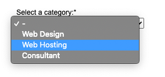
Select Menu
The form field Select Menu adds a drop-down menu to the form, where users can select exactly one option. To allow
multiple options to be selected, you can either enable multiple selection or use a Checkbox Menu
instead of the Select Menu.
Field configuration
Multiple selection: Here you can allow the selection of multiple options.
List size: Here you define how many lines/tall the selection field will be when multiple selection is activated.
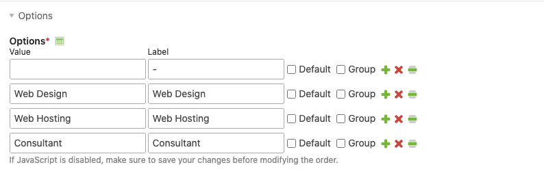
Options
Options: Here you can enter the different options.
A JavaScript wizard helps you when creating the options. You can group options and assign a heading to each group. To make a line a group heading, select the Group option.
Expert settings
CSS class: Here you can enter one or more classes.
Keyboard shortcut: A keyboard shortcut allows a visitor to jump directly to a certain input field by pressing the
[Alt] or [Strg] key in connection with the shortcut key, e.g. a number
(see backend keyboard shortcuts).
Tab Index: Here you can determine the position of the form field within the tab order.
Template settings
Form field template: Here you can overwrite the default template form_select with your owm.
HTML Output
The form field generates the following HTML code:
<div class="widget widget-select select mandatory">
    <label for="ctrl" class="select mandatory">
        <span class="invisible">Mandatory field</span>…<span class="mandatory">*</span>
    </label>
    <select name="…" id="ctrl" class="select mandatory" required>
        <option value="">-</option>
        <option value="…">…</option>
        <option value="…">…</option>
        <option value="…">…</option>
    </select>
</div>
Fields with multiple selection use the CSS multiselect class instead of select.
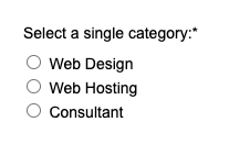
Radio button Menu
The form field Radio button menu adds a list of options to the form from which you can choose exactly one. To allow multiple options to be selected, you must use a checkbox menu.
Options
Options: Here you can enter the different options. A JavaScript-based editor will help you when creating the options.
Expert settings
CSS class: Here you can enter one or more classes.
Template settings
Form field template: Here you can overwrite the default template form_radio with your owm.
HTML Output
The form field generates the following HTML code:
<div class="widget widget-radio mandatory">
    <fieldset id="ctrl" class="radio_container mandatory">
        <legend>
            <span class="invisible">Mandatory field </span>…<span class="mandatory">*</span>
        </legend>
        <span>
            <input type="radio" name="…" id="opt_0" class="radio" value="…" required>
            <label id="lbl_0" for="opt_0">…</label>
        </span>
        <span>
            <input type="radio" name="…" id="opt_1" class="radio" value="…" required>
            <label id="lbl_1" for="opt_1">…</label>
        </span>
        <span>
            <input type="radio" name="…" id="opt_2" class="radio" value="…" required>
            <label id="lbl_2" for="opt_2">…</label>
        </span>
        <span>
            <input type="radio" name="…" id="opt_3" class="radio" value="…" required>
            <label id="lbl_3" for="opt_3">…</label>
        </span>
    </fieldset>
</div>
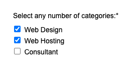
Checkbox Menu
The form field Checkbox Menu adds a list of options to the form, from which you can select as many options as you
like, or none at all. To allow the selection of just one option, you must instead use a radio button menu or a
select menu.
Options
Options: Here you can enter the different options. A JavaScript editor helps you when creating the options.
Expert settings
CSS class: Here you can enter one or more CSS classes.
Template settings
Form field template: Here you can overwrite the default template form_checkbox with your owm.
HTML Output
The form field generates the following HTML code:
<div class="widget widget-checkbox mandatory">
    <fieldset id="ctrl" class="checkbox_container mandatory">
        <legend>
            <span class="invisible">Mandatory field </span>…<span class="mandatory">*</span>
        </legend>
        <input type="hidden" name="…" value="">
        <span>
            <input type="checkbox" name="…[]" id="opt_0" class="checkbox" value="…">
            <label id="lbl_0" for="opt_0">…</label>
        </span>
        <span>
            <input type="checkbox" name="…[]" id="opt_1" class="checkbox" value="…">
            <label id="lbl_1" for="opt_1">…</label>
        </span>
        <span>
            <input type="checkbox" name="…[]" id="opt_2" class="checkbox" value="…">
            <label id="lbl_2" for="opt_2">…</label>
        </span>
        <span>
            <input type="checkbox" name="…[]" id="opt_3" class="checkbox" value="…">
            <label id="lbl_3" for="opt_3">…</label>
        </span>
    </fieldset>
</div>
File Upload
The form field File Upload adds a field to the form that allows visitors to transfer a file from their local computer
to the server. For each upload field, you can define individually which file types may be uploaded and where the
transferred files are stored.
Field configuration
Allowed file types: Here you can enter a comma-separated list of allowed file extensions. If you try to upload another file, Contao will automatically display an error message and refuse to accept the file.
Maximum input length: Here you define the maximum upload file size in bytes. By default, files up to 2 MB can be uploaded.
This feature is available in Contao 4.13 and later.
Maximum image width: When uploading images, the file manager automatically checks their width and compares these values with your default set here. If an image exceeds the maximum width, the upload will be aborted with an error output in the form.
Maximum image height: When uploading images, the file management automatically checks their height and compares these values with your default set here. If an image exceeds the maximum height, the upload will be aborted with an error output in the form.
Store file
Save uploaded files: Select this option to save transferred files in a specific directory on the server.
Target directory: Here you select the storage location for uploaded files.
Use home directory: If you select this option and a member is logged in at the time of uploading, the transferred files will be stored in the member’s home directory instead of the upload directory.
Preserve existing files: By default, Contao overwrites a file as soon as a newer file with the same name is uploaded. If you select this option, existing files are preserved, and new files are given a numeric suffix if they have the same name.
Expert settings
CSS class: Here you can enter one or more CSS classes.
Keyboard shortcut: A keyboard shortcut allows a visitor to jump directly to a certain input field by pressing the
[Alt] or [Strg] key in connection with the shortcut key, e.g. a number
(see backend keyboard shortcuts).
Tab index: Here you can determine the position of the form field within the tab order.
Field size: Here you can set the size of the upload field (size attribute).
Template settings
Form field template: Here you can overwrite the default template form_upload with your owm.
HTML Output
The form field generates the following HTML code:
<div class="widget widget-upload mandatory">
    <label for="ctrl" class="mandatory">
        <span class="invisible">Pflichtfeld </span>…<span class="mandatory">*</span>
    </label>
    <input type="file" name="…" id="ctrl" class="upload mandatory" required size="…">
</div>
Range slider
Expert settings
CSS class: Here you can enter one or more CSS classes.
Default value: Here you can enter a default value for the field.
Minimum value: Here you can set the minimum value for numeric fields.
Maximum value: Here you can set the maximum value for numeric fields.
Step: Here you can set the discrete step size of the field.
Keyboard shortcut: A keyboard shortcut allows a visitor to jump directly to a certain input field by pressing the
[Alt] or [Strg] key in connection with the shortcut key, e.g. a number
(see backend keyboard shortcuts).
Tab index: Here you can determine the position of the form field within the tab order.
Template settings
Form field template: Here you can overwrite the default template form_range with your owm.
HTML Output
The form field generates the following HTML code:
<div class="widget widget-range mandatory">
    <label for="ctrl" class="mandatory">
        <span class="invisible">Mandatory field </span>…<span class="mandatory">*</span>
    </label>
    <input type="range" name="…" id="ctrl" class="range mandatory" value="5" required max="10" step="2">
</div>
Hidden Field
The form field Hidden Field adds a hidden field to the form. Hidden fields can contain any values that are not visible
to users in the form, but are still submitted when the form is submitted.
Default value: Here you can enter the value of the hidden field.
Hidden fields have no CSS class.
Field configuration
Input validation: Here you can specify a search pattern that is used to check user input when the form is submitted.
| Search pattern | Declaration |
|---|---|
| Numeric characters | Allows numbers, minus (-), period (.) and spaces ( ). |
| Alphabetic characters | Allows letters, minus (-), period (.) and spaces ( ). |
| Alphanumeric characters | Allows numbers and letters, minus (-), period (.), underscore (_) and spaces ( ). |
| Extended alphanumeric characters | Allows all characters except those that are normally encoded for security reasons (#/()<=>). |
| Date | Allows entries according to the global date format. |
| Time of day | Allows entries according to the global time format. |
| Date and time | Allows input according to the global date and time format. |
| Phone number | Allows numbers, plus (+), minus (-), slash (/), round brackets (()) and spaces ( ). |
| E-mail address | Allows users to enter a valid email address. |
| URL format | Allows the entry of a valid URL. |
| Absolute URL | since 4.11 Allows users to enter absolute URLs (starting with http:// or https://). |
| Custom | since 4.11 Allows users to enter text according to the given custom regular expression. |
Template settings
Form field template: Here you can overwrite the default template form_hidden with your owm.
HTML Output
The form field generates the following HTML code:
<input type="hidden" name="…" value="…">
Security question
The form field Security question adds a CAPTCHA to the form.
A honeypot is used to trap and lock out spambots. The honeypot consists of several hidden fields that serve as bait. Normal users cannot see the fields and therefore do not change them - but most spambots do. In addition, other factors are checked in the background to differentiate between users and spambots.
If it happens that a visitor is falsely identified as a spambot, they only have to solve a simple calculation. Submitted form data will not be lost under any circumstances.
Field configuration
Placeholder: This text is displayed as long as the field has not been filled in.
Expert settings
CSS class: Here you can enter one or more classes.
Keyboard shortcut: A keyboard shortcut allows a visitor to jump directly to a certain input field by pressing the
[Alt] or [Strg] key in connection with the shortcut key, e.g. a number (see backend keyboard shortcuts).
Tab Index: Here you can determine the position of the form field within the tab order.
Template settings
Form field template: Here you can overwrite the default template form_captcha with your owm.
HTML Output
The form field generates the following HTML code:
<div class="widget widget-captcha mandatory">
    <label for="ctrl">
        <span class="invisible">Mandatory field </span>…<span class="mandatory">*</span>
    </label>
    <input type="text" name="captcha" id="ctrl" class="captcha mandatory" value="" aria-describedby="captcha_text" placeholder="…" maxlength="2" required>
    <span id="captcha_text" class="captcha_text">…</span>
    <input type="hidden" name="captcha_hash" value="…">
    <div style="display:none">
        <label for="ctrl_hp">Do not fill in this field</label>
        <input type="text" name="captcha_name" id="ctrl_hp" value="">
    </div>
    <script>
        var e = document.getElementById('ctrl'),
            p = e.parentNode, f = p.parentNode;
        if ('fieldset' === f.nodeName.toLowerCase() && 1 === f.children.length) {
            p = f;
        }
        p.style.display = 'none';
        e.value = '…';
    </script>
</div>
Submit field
The form field Submit field adds a button to the form in order to submit the form, which can be either a text button
or an image button.
Submit button label: Enter the text of the submit button or mouse-rollover text of the screen button here.
Image button
Create an image button: Use an image submit button instead of the default one.
Source file: Here you select the image for the image button.
Expert settings
CSS class: Here you can enter one or more CSS classes.
Keyboard shortcut: A keyboard shortcut allows a visitor to jump directly to a certain input field by pressing the
[Alt] or [Strg] key in connection with the shortcut key, e.g. a number (see backend keyboard shortcuts).
Tab Index: Here you can determine the position of the form field within the tab order.
Template settings
Form field template: Here you can overwrite the default template form_submit with your owm.
HTML Output
The form field generates the following HTML code:
<div class="widget widget-submit">
    <button type="submit" id="ctrl" class="submit">…</button>
</div>